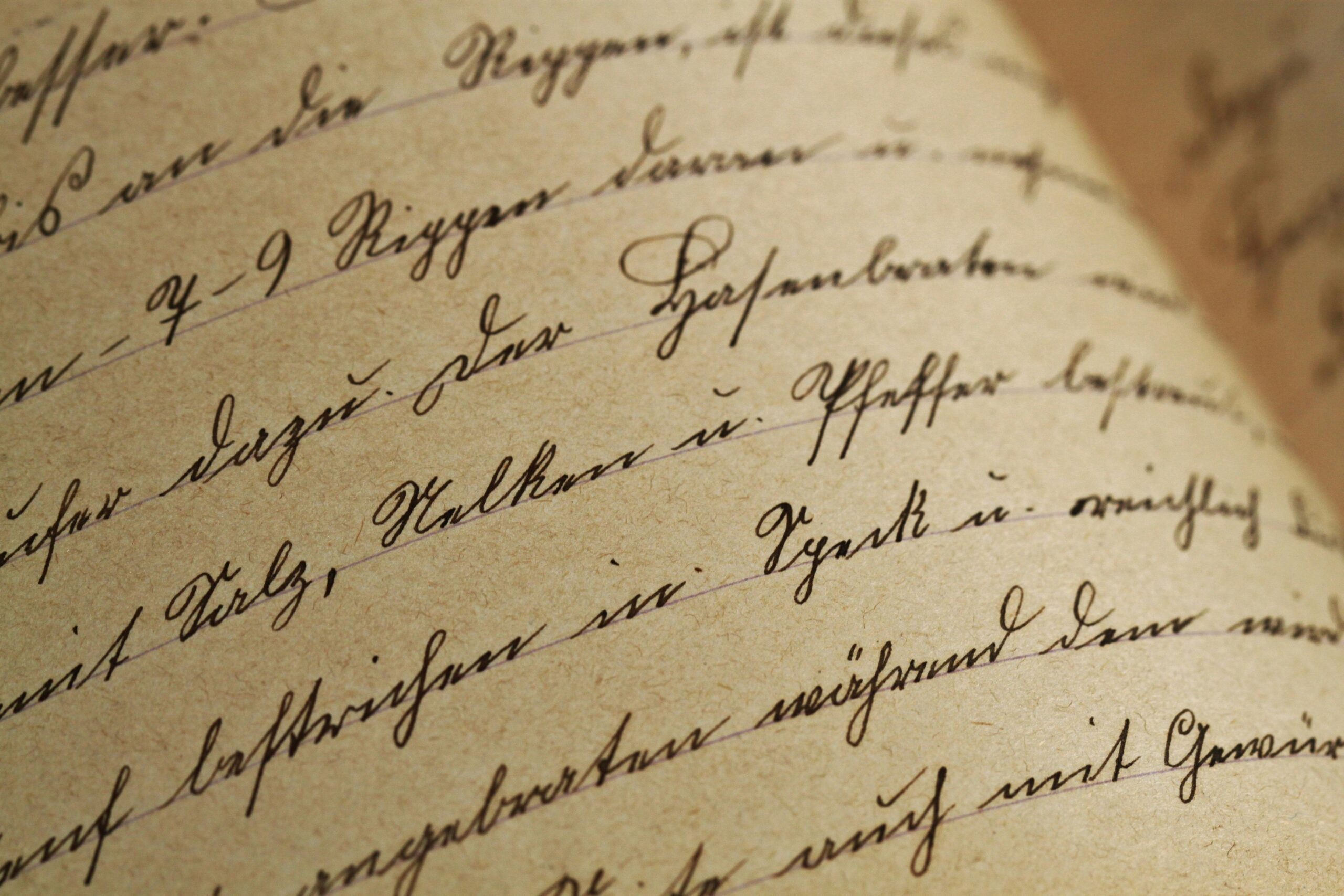
When it comes to design, every detail is critical – the colour, the shape, all the way down to the font. A font can make or break good design – it’s got to fit in with your feel and your brand. A god font stands out from the crowd – so what makes a good font?
Can you read it? Perhaps a pretty obvious point, but a really important one! A fancy font can look lovely, but if your customer can’t read it easily and the message is lost, there’s no point!
Check out spacing. Linked to a font being readable, consider how well spaced out the letters are. If the words look scrunched up it won’t be easy to read or pleasant to the eye.
Consider font weight as well as shape. Does the readability change depending on font weight? Are the shapes of the letters different enough to stand out and help readability?
Do your research! Once you’ve narrowed it down to a few options, consider a focus group or market research test to see what your key customers think works best. The customer is always right!
For more information about our latest design and creative vacancies, or to find out how FS1 can support your studio, contact us on 01908 787 560 or hello@fs1recruitment.com.

